The Psychology of Consent Banners: How Colors, Icons, and Language Shape User Trust
January 22, 2026
•
3 min read
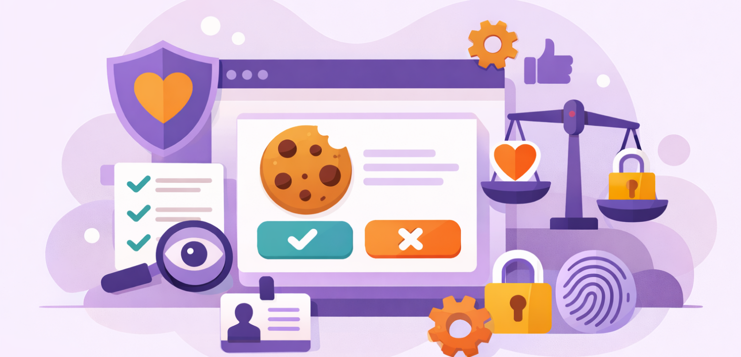
Table of contents
back
to the top
The Psychology of Consent Banners: How Colors, Icons, and Language Shape User Trust
When designing a cookie banner, you’re doing more than arranging buttons and text—you’re shaping how users perceive trust, transparency, and control on your website. Every choice, from the color of a button to the words you use, subtly signals your intentions to visitors. Around the world, regulators, UX researchers, and behavioral psychologists are studying how visual design, iconography, and language impact consent behavior—and the results are clear: design matters, more than many brands realize.
In this post, we’ll explore how colors, icons, and semantics influence user trust, examine what regulators say about “dark patterns,” and provide actionable strategies to optimize your CMP (Consent Management Platform) design for both compliance and higher-quality consent.
What Colors Communicate in Consent UI
Color psychology is often underestimated, but it’s a powerful factor in guiding user decisions. Different colors evoke distinct emotions and associations, influencing how users interpret your intentions—often subconsciously.
-
Green usually signals approval, safety, or recommendation. It conveys “this action is safe” and encourages affirmative clicks.
-
Red suggests risk, warning, or caution. It can deter certain actions, but using red inappropriately could intimidate or frustrate users.
-
Gray is neutral or subdued, signaling indifference or a background option. It’s often used for secondary buttons like “Reject All.”
-
Blue is widely associated with trust, calmness, and reliability. Many financial and tech companies leverage blue to reinforce credibility.
Some websites intentionally highlight “Accept All” in bright, attractive colors while making “Reject All” duller or smaller—a practice regulators increasingly consider manipulative. The goal of consent design should never be to push users toward a decision but to communicate options clearly and fairly.
A globally compliant CMP design should:
-
Give equal visual prominence to “Accept” and “Reject” buttons.
-
Use consistent, non-manipulative color palettes.
-
Maintain high contrast for accessibility across devices and users with visual impairments.
-
Add visible borders or spacing to emphasize button parity and clarity.
Icons and Their Influence on Trust
Icons are a powerful tool—they help users understand choices at a glance—but they can also be subtly persuasive.
Consider the implications of these common icons:
-
A shield icon might imply enhanced security, making users feel safer consenting.
-
A checkmark could subtly nudge users toward approval.
-
A warning icon may intimidate, pushing users to consent out of fear.
Regulators are increasingly scrutinizing icon usage that could mislead or influence decisions. Modern CMPs should use icons sparingly and intentionally, ensuring they clarify choices rather than manipulate them. When done correctly, icons improve comprehension without biasing behavior.
Semantics: Why Words Matter More Than You Think
The language used in consent banners carries weight, shaping user perception and willingness to consent. Phrases like “improve your experience,” “essential cookies,” or “our partners” can influence decisions, intentionally or not.
Common pitfalls include:
-
Vague descriptions: “We use cookies to enhance functionality” doesn’t explain what data is collected or why.
-
Overly positive framing: “Help us keep the site free!” may feel persuasive rather than neutral.
-
Understating implications: “We share select data with partners” leaves too much ambiguity.
The key is plain, direct, and transparent language. Clearly explain what’s being collected, why it matters, and how it will be used. When users understand the purpose, they’re more likely to provide informed and valid consent.
Why Ethical Design Improves Consent Quality
Avoiding dark patterns isn’t just about avoiding fines—it’s about protecting your brand and building trust. Ethical design leads to:
-
Higher-quality, valid consent from users.
-
Improved long-term engagement and customer loyalty.
-
Reduced legal and reputational risk.
When users trust your CMP, they feel in control rather than coerced, which improves both user satisfaction and the value of the data you collect.
Final Takeaway
Even subtle design choices—colors, icons, words—shape how users perceive your brand and whether they trust your website. With regulators cracking down on manipulative practices, businesses must ensure CMPs remain neutral, transparent, and accessible. Ethical design isn’t just a legal necessity—it’s an investment in better user experience, stronger relationships, and sustainable consent quality.
Explore further
Cookie Consent for Webflow, Wix, and Squarespace Websites
Learn how to set up cookie consent for Webflow, Wix, and Squarespace websites, including cookie scanning, auto-blocking, policies, and Google Consent Mode v2.
July 2, 2026
7 min
Privacy Compliance for Landing Pages: What Marketers Often Forget
Landing pages often load trackers, forms, embeds, and advertising tags. Learn the privacy checks marketers should complete before campaigns go live.
July 2, 2026
8 min
Consent Mode Debugging: How to Check If Google Tags Respect User Choices
Learn how to verify that Google Analytics, Google Ads, and Google Tag Manager actually respect consent choices before and after users interact with your banner.
June 25, 2026
4 min